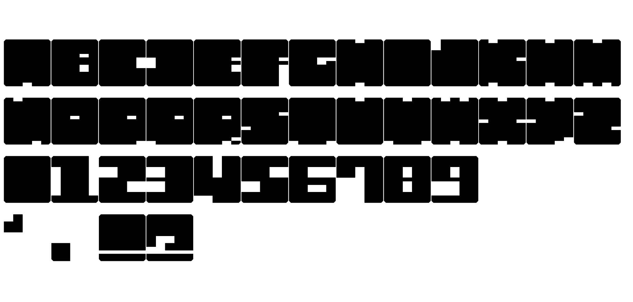
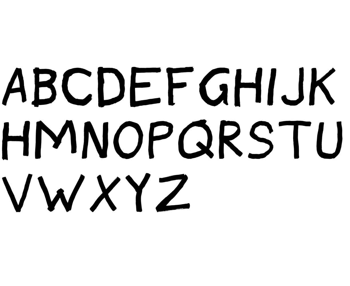
MTA
Typeface
MJM Graphic Design
This typeface was made during my time at MJM Graphic Design in Marseille. It is part of the Atype family. It questions the role of legibility in typography. Where is the line between understanding a glyph and appreciating its beauty?
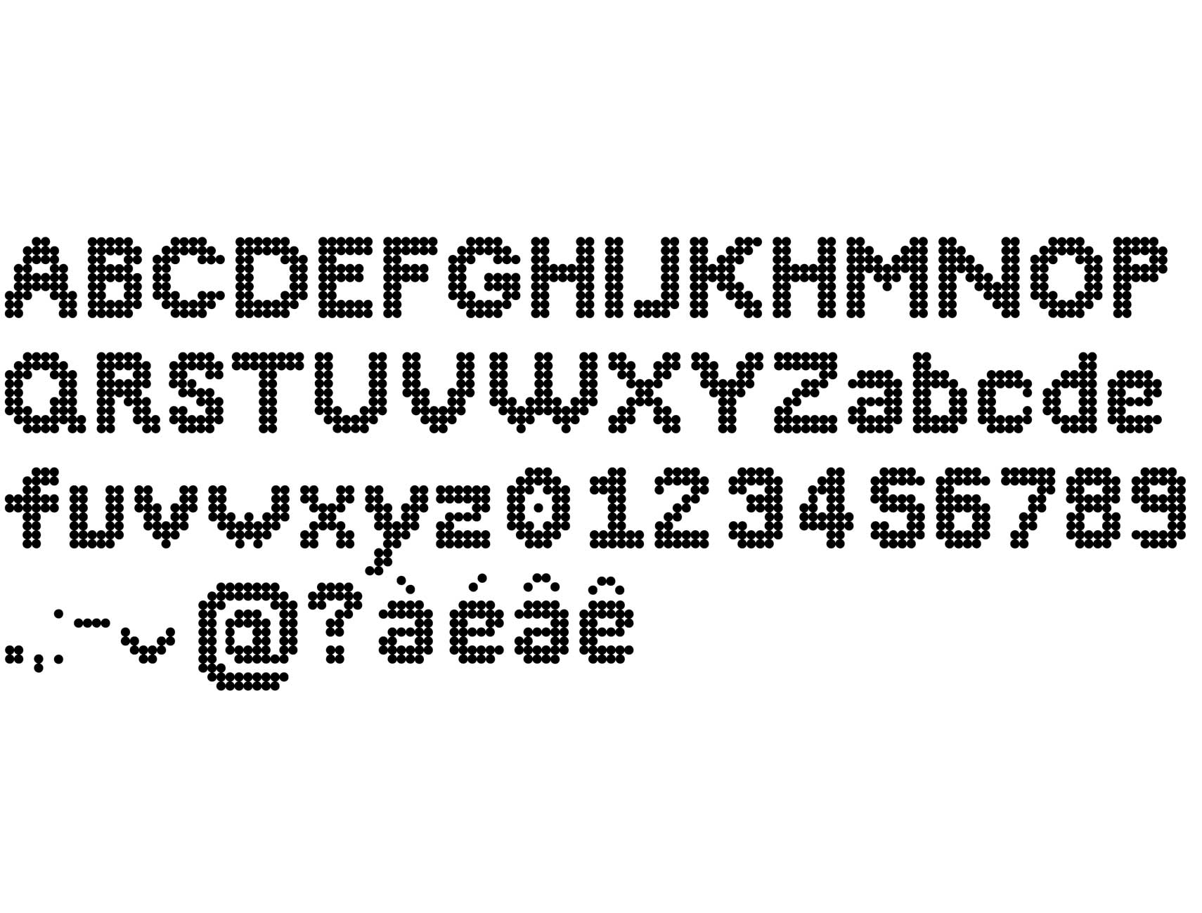
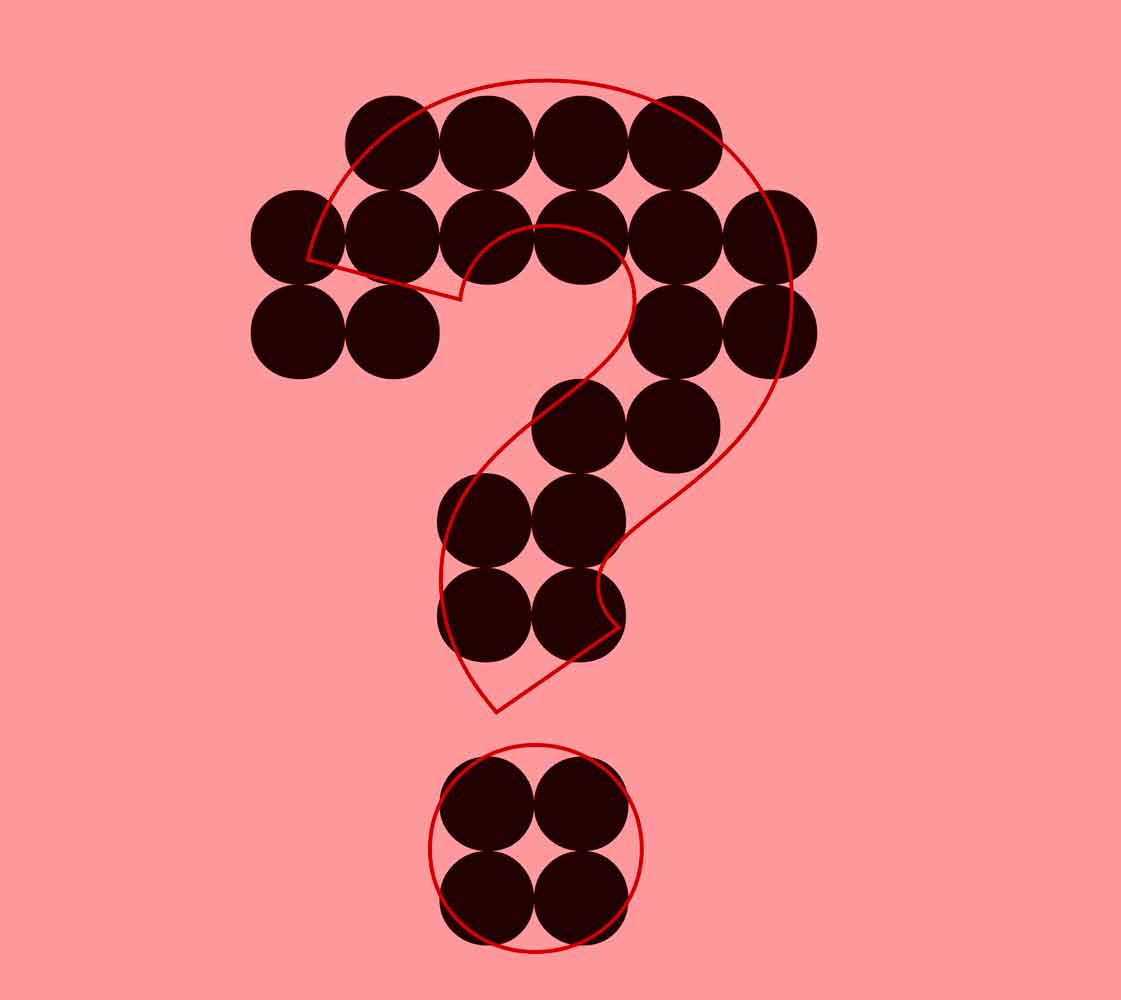
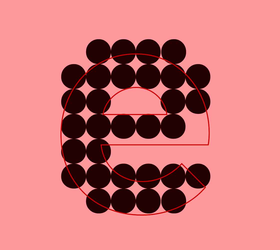
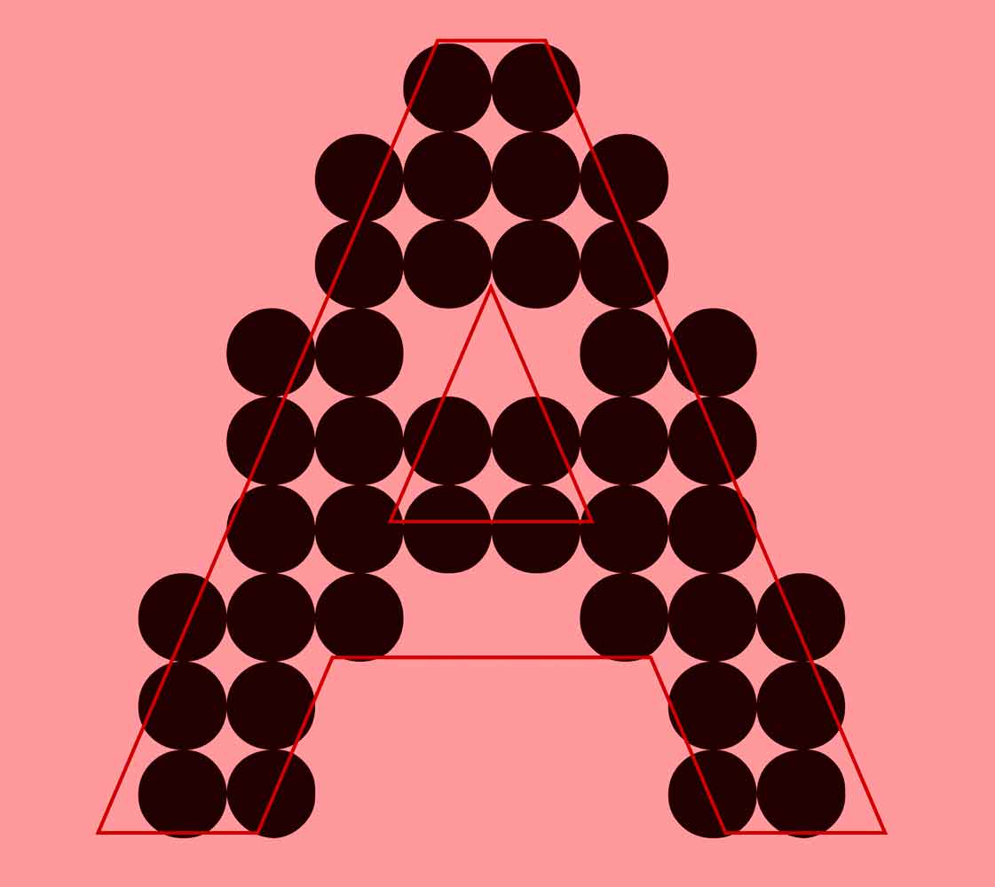
Circlotte
Typeface
CPNE pôle AA
This project was created during the development of the visual identity for BRO. This typeface was first designed for the logo, and then became a full part of the identity. It was a fun way to experiment with type design inside a complete system. And it’s called Circlotte because I was watching Kaamelott in the background while creating it.
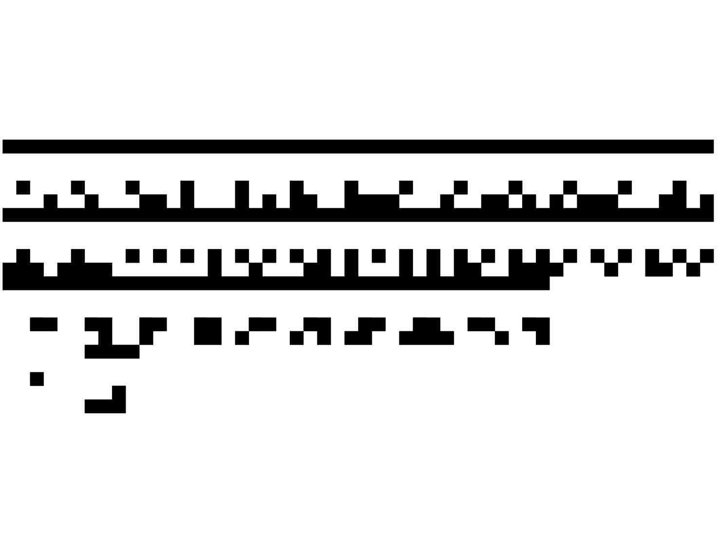
Scratch
Typeface
CPNE pôle AA
Scratch was first made on paper. During a project at CPNE, I worked on writing directly on my own posters to create a fake vandalism effect. I then decided to make it real on my computer. You can see more about the Zéro Déchet project on the Systems page.
1_0_1
Typeface
Diploma Project
This typeface was made during my diploma at CPNE La Chaux-de-Fonds. It is the conclusion of the project: what if humanity was destroyed and only AI and robots survived? What would our 26-letter alphabet look like through their eyes?
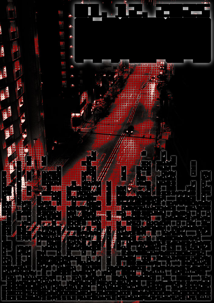
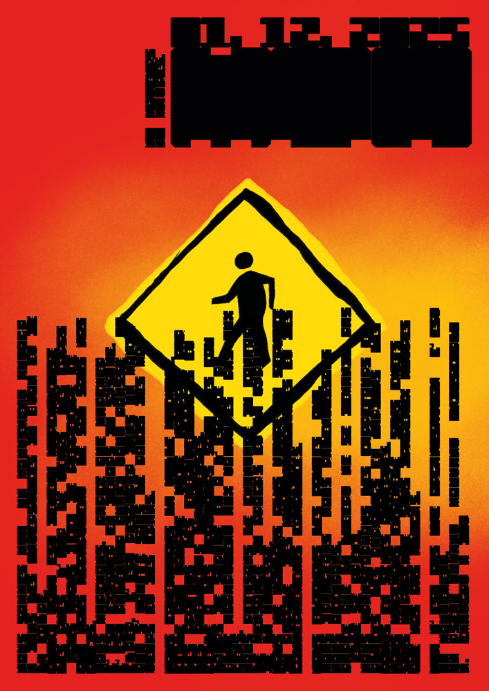
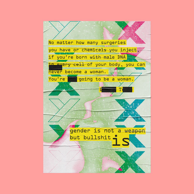
K Poster
Poster
These are some posters I made in a one-hour period. The first theme was “Making society” (Faire
société).
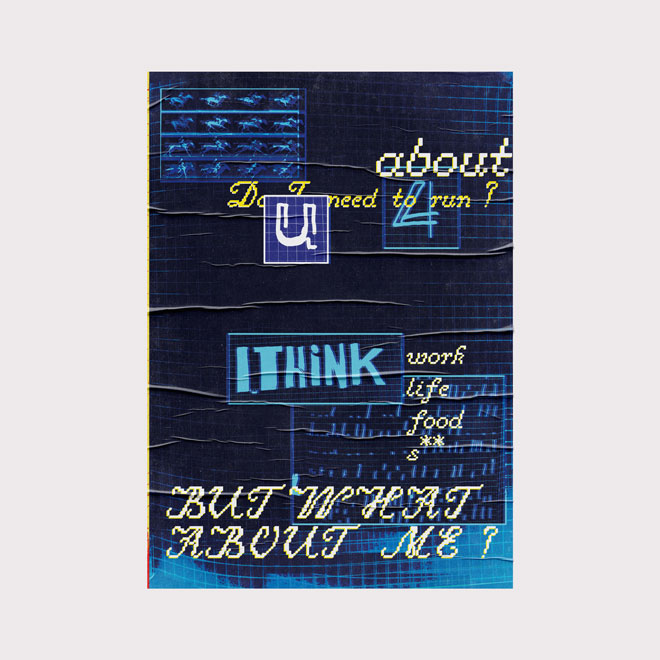
Made a music into a poster (Buzzkill from Take Van)
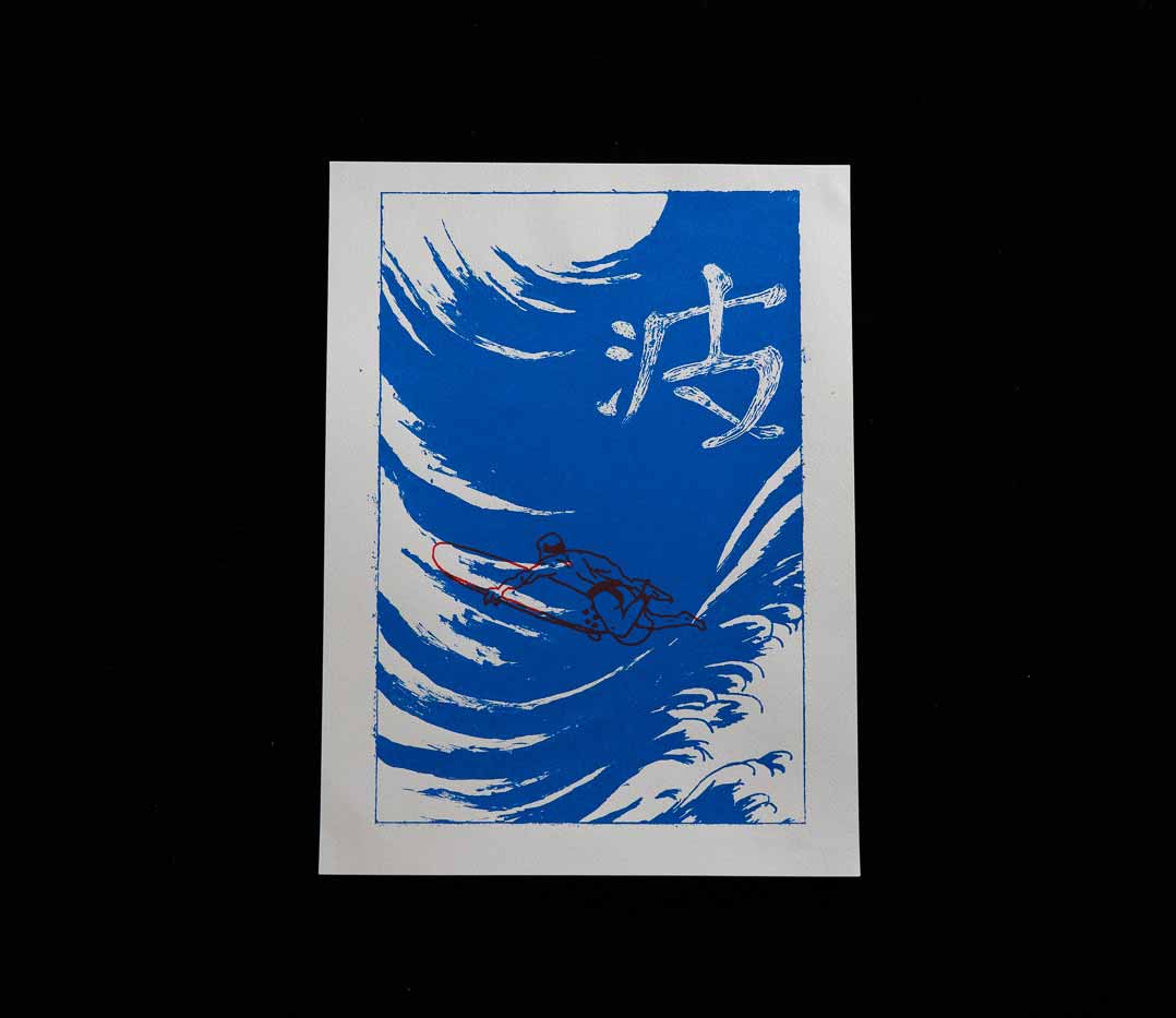
Nami
Screen Printing
This was my first time doing screen printing (sérigraphie). I took some prints by Hokusai and mixed them together to create a whole new visual.